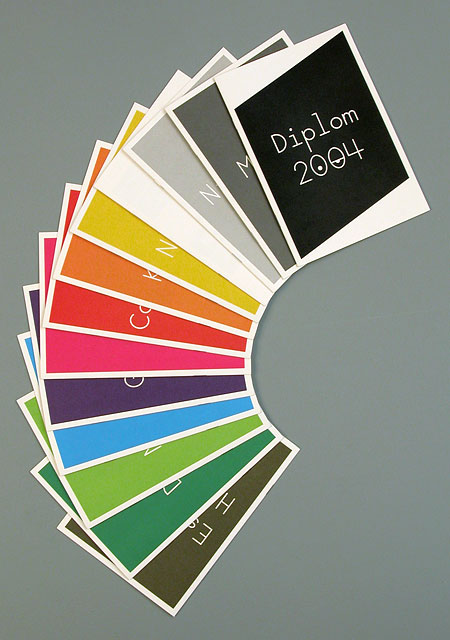
This particular publication caught my eye as it was an interesting and uncommon subject. the colour scheme works really well together along with the type and layout. also the simple layout inside the publication uses negative space effectively.
I really like this publication. Again a large format print, only in black. Cheap and quick to produce. even though it looks simple it still has a quality about the finish and layout. I like the use of large type spreads along with the editorial layout.
I came across Luke's work on the Just Us Collective website. his work on self initiated publications is really nice with a clean attention to detail and layout being considered. This will provide inspiration for future projects and current briefs.
Previously i have had problems with applying layout and type when using imagery. i do believe that to have good layout you have to be handling good photographs. so photography is key when dealing with layout and any other type of design that requires photography. Newwork keep it ever so simple, even down to limited colour, which gives the design a neutral colour which i think works well but has to be done in the right time and place.
I think being able to use image and type together in a way that they compliment each other rather than begin squeezed onto a page is a crucial part of designing a publication. Here he uses a range of typefaces and images in a way that creates a depth and flow through his work. this is something i need to adopt and take more time over. Being able to do this will bring a quality to my work and is something i will now consider in my fedrigoni brief along with my film directors publication.