unequal design

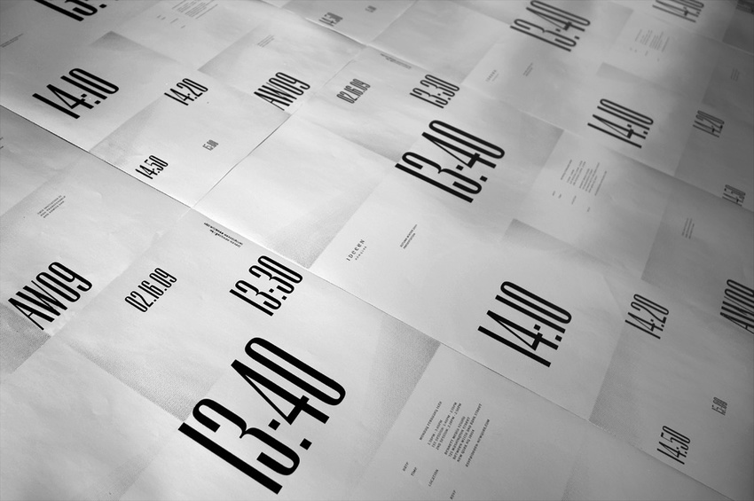
I really like this publication. Again a large format print, only in black. Cheap and quick to produce. even though it looks simple it still has a quality about the finish and layout. I like the use of large type spreads along with the editorial layout.


Unequal design


Some really nice work with type, layout and image on this publication. something i can inspire from when working on my own large scale publication.


Luke sully

I came across Luke's work on the Just Us Collective website. his work on self initiated publications is really nice with a clean attention to detail and layout being considered. This will provide inspiration for future projects and current briefs.


Studio Newwork

I have been a fan of Newwork studio for a while now and use there work for inspiration. They're use of colour and simple layout is whati want to take on board and contribute into y own work. They use vibrant colours and typefaces along with unique and effective layouts.


Carlos Tarrats


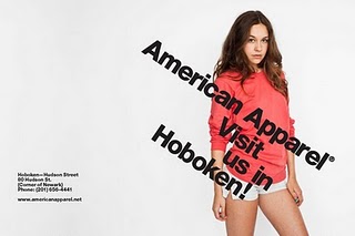
I came across this designer on a friends blog and it attracted my eye. I have always been impressed by American Apparel's identity branding and the simple clean style that they hold. After researching and completing my dissertation on helvetica it was found through my research that with american apparel using helvetica it creates an identity which a brand can follow with its this and style. Which is exactly what it does here. The style and layout used is also that of the swiss design style to compliment the well known swiss typeface.