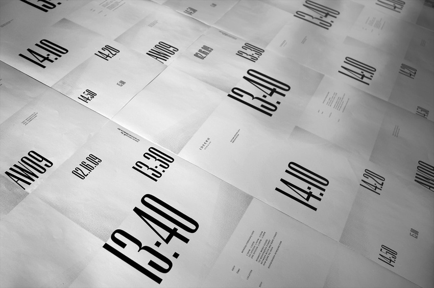
I really like these mailers that DYHR have designed. They are not the usual poor production mail out, you can see quality through the design and stock given. i really like the brown light weight card stock they have used for there poster and the way they have incorporated this into packaging the imagery and booklet.
Make Studio
Designers Republic
This piece by the Designers Republic caught my eye. Not only because my style is keep things simple and with this it is with black on a chosen stock but because it has a rough edge feel to it as well as being sharp, clean and precise. The cream/white stock gives it the feel of purity and cleanliness with the harsh contrast of the circle along with the hand painted texture which gives it a rough ragged feel which could emphasis parts of music culture.