I saw this piece late last night and was immediately attracted to the simplicity of it. They have used a standard typeface but the sharpness of the characters against he softness of the circle is a big contrast, but somehow the circle over powers the type in terms of hierarchy. Thats a really clever, precise piece of design even though it looks so simple.
R2 design
unequal design
Unequal design
DYHR
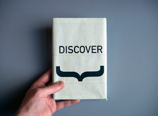
I really like these mailers that DYHR have designed. They are not the usual poor production mail out, you can see quality through the design and stock given. i really like the brown light weight card stock they have used for there poster and the way they have incorporated this into packaging the imagery and booklet.
GF Smith
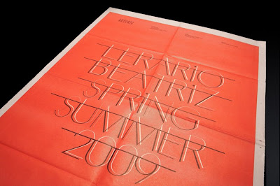
This piece is beautiful and the kind of design i want to produce. The type layout, colour scheme along with stock and finish is perfect. it glows pure quality and professionalism.
Many Stuff
I came across this exhibition poster for the architecture of critical graphic design whilst browsing for inspiration for the swiss design exhibition brief. i was directed to the Many Stuff website. The use of type and layout in this piece is really effective, getting alot of information on one page and not making it seemed over crowded or illegible. also the grey and green colour scheme is very modern and shows contrast between architecture being the grey and the bright green being design.
Luke sully
Make Studio
Studio Newwork
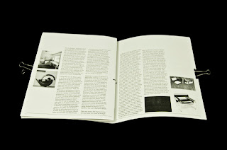
Previously i have had problems with applying layout and type when using imagery. i do believe that to have good layout you have to be handling good photographs. so photography is key when dealing with layout and any other type of design that requires photography. Newwork keep it ever so simple, even down to limited colour, which gives the design a neutral colour which i think works well but has to be done in the right time and place.
Designers Republic
This piece by the Designers Republic caught my eye. Not only because my style is keep things simple and with this it is with black on a chosen stock but because it has a rough edge feel to it as well as being sharp, clean and precise. The cream/white stock gives it the feel of purity and cleanliness with the harsh contrast of the circle along with the hand painted texture which gives it a rough ragged feel which could emphasis parts of music culture.
Ill Studio
Coming across Ill studio i found this really effective example of packaging design. They have used a bubble wrap pocket with a reflective silver finish to house the mix tape begin sold. Attention to detail and using unusual finishes is what really sells this product as it packaged originally which makes it stand out.
Studio Newwork
Carlos Tarrats
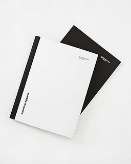
I came across this designer on a friends blog and it attracted my eye. I have always been impressed by American Apparel's identity branding and the simple clean style that they hold. After researching and completing my dissertation on helvetica it was found through my research that with american apparel using helvetica it creates an identity which a brand can follow with its this and style. Which is exactly what it does here. The style and layout used is also that of the swiss design style to compliment the well known swiss typeface.


